About Me

My photo
"JGallery" where I talk about my artwork and show my pre-painting sketches and drawings and crap like that

Thursday, January 9, 2014

three kings (3 moth edition print)


This is a deaths head moth. One of 3 in this series of prints. The edition of this print was 10 I believe. when I start to do and edition I tend to print at least 15 or 20, and then compare all of them with the B.A.T and chose which ones to include in the edition, regardless of the number of the edition itself. 

Why hello there. 


Its always good to have a selection of different kinds of paper too, bfk rag paper and litho white are my favourites to work with, but there are some really great japanese papers that you can get to experiment with too.

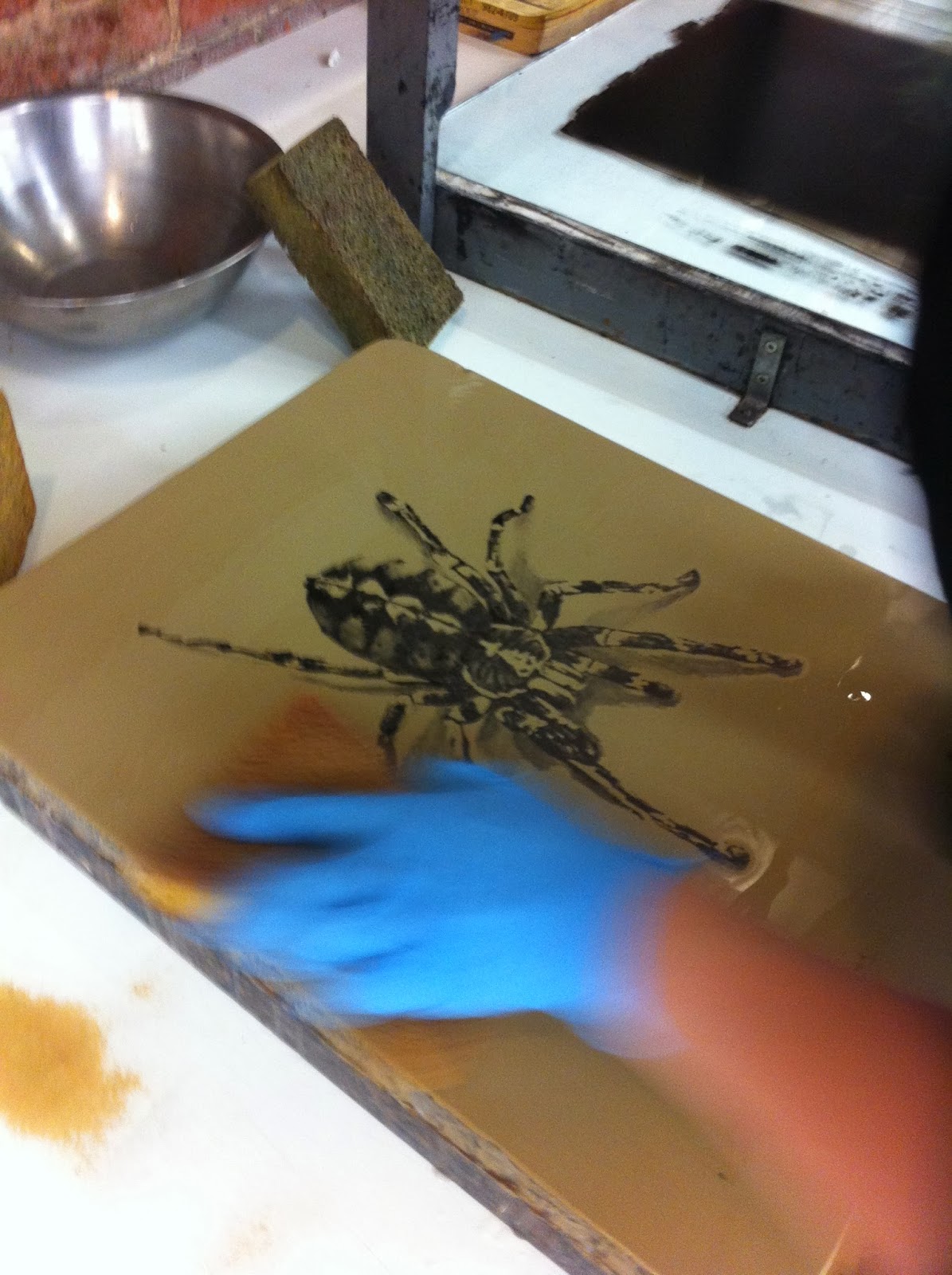
This is what my set up looked like, its good to have things nice and organized, that was something I picked up from a few of my professors at my university.


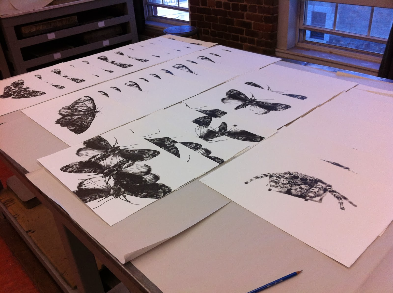
The print with the multiple moths was the third in this edition, unfortunately since it was a random drop print I didn't feel like it was necessary to do a close up shot. half of the edition for the final print of 'Three Kings' was a random drop while the rest were printed like the others. In this photo theres also 'The Jumper' a highly detailed print of a jumping spider. I feel that this print was rather successful in what I was after, mostly because things that are seen as small and insignificant, do bare weight and have an impact to the world. this is also true for people. So hopefully this spider gets my point across. 


I took a couple of weeks off for the christmas break, since I didn't go anywhere for christmas and just stayed here I ended up working a lot more than I thought I was going to, which in a way was good, but this holiday really takes a chunk out of you when you don't really have the money for it. hope all is well  to whom ever stumbles upon this.

Friday, December 20, 2013

Figure painting (spring 2013)

This is one of my paintings from university. It was set up like a critique was taking place in the painting with three of my friends sitting and one standing. I used a photo for reference, for proportion only and had my friends sit in as models as I painted. I map out my paintings the same way each time by using either burnt umber or raw senna. these colours are perfect for me when i'm mapping out tones. 

The hardest thing about figure painting is getting the flesh tones right. your painting could look fantastically painted but if your colours are off, the painting looks weird and in my university the professors aren't afraid to tell you to start over(even if the project is due in 2 days). When it comes to painting flesh tones, the one colour that I never use is FLESH TINT, it is possibly the worst colour ever. all it is is an off tint of pink that can easily be made when your mixing your colours. There is no need to buy it. The only time when I buy a colour that I can easily mix myself is if I need a lot of it, other than that I mix all my colours. 
When it comes to my colour palette, I use a double primary palette when I paint. A palette with double primary colours can make practically every colour you could ever need. 

There is a lot of colour going on in the legs of this painting, which is really good. Skin isn't just one colour, its many colours layered on top of each other to create rich ochres and pinks and greens and blues, yes those colours are in skin too. 

I painted over the rip in the jeans, it just didn't look right and for some reason I was having the worst time painting that part of the leg. 
See? much better. And I almost forgot Kassy's tattoo haha. I really liked working on this painting even though the class was a complete bust. It was awesome having a work environment with close friends. 

Wednesday, December 18, 2013

I have instagram now


Instagram

Thursday, December 12, 2013

The starting of my Doctor Who prints

This here is a full bleed print. Now a full bleed in printmaking is just as it sounds, the original paper colour was white, so I put this paper through the press about 2 times to get the intensity that I wanted. When it comes to printing with colour, especially a blue as specific as the Tardis, the colour roller has to be extremely clean. This way the colour comes out as intense and clean as possible. In the photo it doesn't look like the colour matches the Tardis, but trust me it does.  

My hands after printing, stained for the next 4 days after.

ugh gross. 
The next layer on this print was the Tardis, that was a toner transfer( that didn't work and I had to hand draw most of it) after which I wrote "just a mad man with a box" underneath it. This print was rather simple, and is an extended edition. I have about 12 or so prints of it just on white litho paper, and the other 8 where on the full bleed.


they turned out rather well, but there was something missing, so I let them set up for about 2 weeks while I worked on other prints and what not. After it was dry I hand tinted the windows of the Tardis to make it more unique. 
Hand tinting prints after they are done is pretty simple. All you need to to is water down litho ink with estisol, it worked rather well. It took about 3 times until the light colour showed up against the dark blue. from start to finish, I think that this one turned out pretty good.

looks pretty good.

Oh look a MOUSE! 

This turned into an edition of 6, with a BAT and 1 artist proof.


Thursday, December 5, 2013

The Proofing and Printing Process

When it came to printing my tarantula it went really smoothly, sometimes printing and proofing can become a disaster. So you really need to no when its ok to say FUCK IT and start over. But when it came to my first test run back in the print studio, it went really well. The proofing of the image was finished within an hour on regular sketchbook paper until the image was to where I wanted it (press pressure wise that is) and after the proofing was done I went straight to printing.  when it comes to printing an edition you need to establish a B.A.T print, that is the print that all of your proofs are based off of and are compared against, and it they match the B.A.T perfectly they become a part of the edition. 


The only thing with this print that I don't like is the fact that it was just a test, and I didn't want to put the time into it. I could of obviously pushed it farther, and perhaps I will this fallowing summer, but until then, this print will remain unfinished. 


Thursday, November 28, 2013

The Beginning stages of my litho experiment (Lithography 2013)

First things first, I'm sorry it took sooooo long for me to get this blog done. So lets start this. In the summer I took an extended studies program at the University I attended, this extended studies program was geared toward my self exploration and generally just me trying to learn how to achieve things with this medium on my own. I took an intro class the fall before and I loved it so much that I wanted to continue my litho practice. Since I had no idea where to start, I started where I left off, with prints of Bugs. The fist "test" print I did was of this tarantula, I call it a test print because I haven't done any litho since the fall and I needed something to refresh my memory. So BUGS! BUGS! BUGS! :D
Drawing on a lime stone is quite simple, you can use different grades of litho pencils or even inks, in this picture above I was drawing with a number 2 litho pencil and I gummed out areas that I wanted to stay perfectly white. 

After the drawing is done, you have to process it, so in the picture above i'm talcing up my image( this was after applying resin and dusting it off). this is before you apply your etch, which is nitric acid mixed with 1 ounce of gum arabic. 


The above 7 pictures are of me doing the second etch, unfortunately I forgot to get pictures of the first etch. The first etch sets the image into the stone, making the parts of the stone that were not drawn on water loving and the parts that were drawn water repellant. after you duff the first etch into the stone, you can clean the stone with estisol, to dissolve all the litho pencil, after all the pencil is gone, you wash the stone off with water and apply ink, now before this when the stone is ready for ink the image will still be there, but it will be a faint sepia tone on the stone, once you roll up your image ( which is what I was doing in the images above) you can pour your second etch. 

After the image is processed and rolled up with ink, you can move on to printing :D!

Friday, October 18, 2013

fucking phone..

I will eventually be blogging about my time in extended studies and what I was doing in the print studio. I have a lot of photos and I need to transfer them off of my phone before I get a new one and thats taking a really long time. So hopefully I can get this done soon, I want to be more active with my blog and art again and stay sharp. I don't want to just work all the time and not be about to do any art that I want to do, Merrrr hopefully shit gets done.